
Layers: maps and sections
This chapter explains the settings and caveats of each kind of layer drawn on maps and sections. Layers for 1-D plots and scatter plots are in Layers: 1-D, scatter and aggregation, and examples of the figures you can draw are in the Gallery. The numerical assumptions behind value transforms, mask-out and region cropping are listed in Computational conventions.
| Layer | Horizontal map | Vertical cross-section | Time section |
|---|---|---|---|
| Fill, contours, hatch | yes | yes | yes |
| Vectors, streamlines | yes | yes | no (two components cannot be defined on a time axis) |
| Scatter (points), track (trajectory) | yes | no | no |
Adding, deleting and reordering layers
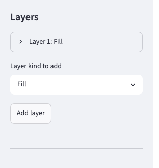
The "Layers" section of the sidebar lists one "Layer {n}: {kind}" per layer. When a mode is opened for the first time it holds a single fill layer.
- Add: choose "Layer kind to add" at the end of the section and click "Add layer". The new layer is appended at the end.
- Delete: "Delete this layer" at the end of each layer. The last remaining layer cannot be deleted. There is no toggle to hide a layer temporarily, so delete it when you do not want it.
- Reorder: "↑" and "↓" at the top of each layer. The settings move with the layer. The order is the drawing order and the legend order; on maps it only affects the stacking of layers of the same kind (Stacking order).
- Change the kind: "Kind" switches the layer to another layer kind.
- File and variable: when several files are loaded, "File" appears at the top of each layer. Then select "Variable". On a horizontal map the candidates are variables with both latitude and longitude dimensions; on a section they are variables with the two axes of the section.
- Fixing dimensions: among the dimensions of the variable, those other than the plotting plane and time (such as vertical levels) are fixed per layer with "{dim} [{units}]". On sections you can choose between "Fixed value" and "Range mean" (Data handling).
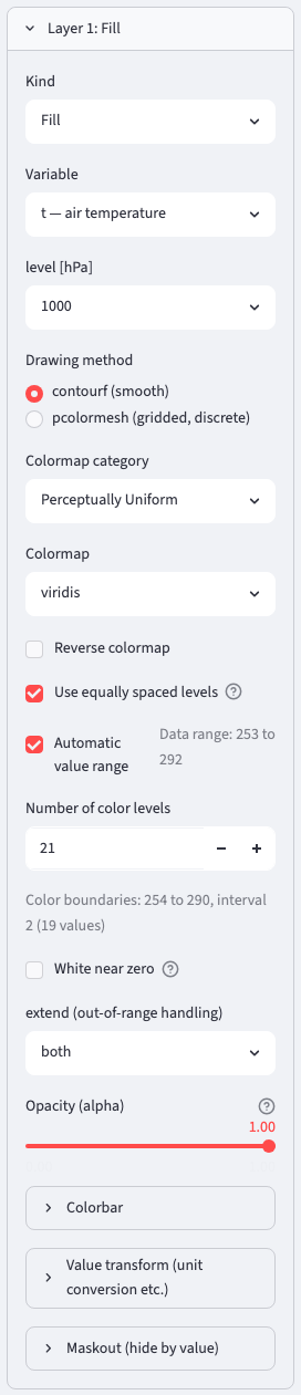
Fill and contour layers show the reference lines "Data range: …" and "Color boundaries: …" ("Contours: …" for contours). The values are computed from the data after applying the selected time, level, region, mean, value transform and mask-out.
Stacking order
On maps the stacking of elements is determined by the default zorder of matplotlib and cartopy, and the layer order only affects elements at the same height. Swapping fill and contours leaves the contours on top. Hatch, vectors and scatter points placed before a fill are hidden by an opaque fill.
Vertical cross-sections and time sections follow the same rule. Contours and streamlines are always drawn above fill, hatch and vectors, while fill, hatch and vectors stack among themselves in the layer order (the later one, i.e. the lower row of the layer list, is on top). To show vectors or hatch above a fill, place them after the fill. Ocean, land, coastlines, gridlines, scatter and track in the table below are map-only elements.
| Element | Default | "Fill land" → "Draw above data" on |
|---|---|---|
| Ocean and land fill | 0 | ocean 0, land 1.4 |
| Fill, hatch, vectors | 1 | 1 (hidden by land) |
| Scatter (points), track points | 1 | 1.5 (shown above land) |
| Vector key | 1.1 | 1.5 |
| Coastlines, borders | 1.5 | 1.5 |
| Contours, streamlines, track lines, gridlines, boxes, marker annotations | 2 | 2 |
| Text annotations, gridline labels | 3 | 3 |
| Contour labels | 4 | 4 |
This table does not apply to sections, where the layer order is the stacking order as it is.
Fill
"Drawing method" selects "contourf (smooth)" (default) or "pcolormesh (gridded, discrete)". contourf fills only up to the centers of valid grid points, so a gap may appear along the coastline (Missing values). pcolormesh fills the grid cells as they are.
Colormap
Select in two steps, "Colormap category" and "Colormap" (default: viridis in Perceptually Uniform). "Reverse colormap" gives the _r version. The categories are Perceptually Uniform / Sequential / Sequential (2) / Diverging / Cyclic / Qualitative / Others; the diverging RdBu_r and RdYlBu_r are included as reversed versions to follow the climate convention (low = blue, high = red).
- External packages: when cmocean, cmcrameri or cmaps is installed, it is detected automatically at startup and categories such as "cmocean (Oceanography)" are added. A reproduction script of a figure that uses them also depends on that package.
- Custom colormaps: files placed in
~/.climcanvas/cmaps/, one colormap per file, appear in the "Custom" category. The formats are.rgb/.txt/.datwith R G B per line (separated by spaces or commas); lines starting with#are comments, and if the maximum value exceeds 1 the values are taken as 0 to 255. The file name is the colormap name. "Reverse colormap" works too. The reproduction script embeds the values themselves. The distribution ships samples in the 3 formats indata/sample/cmaps/(sample_div_bwr.rgb/sample_seq_teal.txt/sample_rainbow256.dat); copy them to~/.climcanvas/cmaps/to try them.
Levels and value range
| Item | Content | Default |
|---|---|---|
| Use equally spaced levels | When on: "Automatic value range" and "Number of color levels" (3 to 60). When off: enter the boundaries directly in "Levels (comma-separated)" (uneven spacing allowed, at least 2) | on, 21 |
| Automatic value range | When off, enter "Max" and "Min". The initial values are the range of the selected slice (after the value transform). Switching the variable resets them | on |
| extend (out-of-range handling) | both / neither / min / max. The colors of out-of-range values are shown as arrows on the colorbar | both |
| Opacity (alpha) | Below 1 with contourf, thin seams may be visible at level boundaries (not with pcolormesh). The same transparency applies to the colorbar | 1.0 |
With "Automatic value range" on, matplotlib chooses round boundaries from the number of levels, so the reference line "Color boundaries" matches the actual figure. When the range is given by hand, the interval from Min to Max is divided equally.
White near zero
Turning on "White near zero" makes the color band containing 0 white. When 0 falls exactly on a boundary the two adjacent bands become white; when it falls inside a band, that one band. Nothing happens if the levels do not straddle 0. Use it when drawing positive and negative anomalies with a diverging colormap. Layers that use a colorbar, such as vectors, streamlines and scatter points, have the same item once "Discretize colors" is on. Contours do not have it (the line would just turn white and disappear).
Colorbar
The "Colorbar" items of each layer are the same regardless of the layer kind.
| Item | Content | Default |
|---|---|---|
| Show colorbar | on | |
| Colorbar label | Empty for no label. Switching the variable resets the initial value | variable name [units] |
| Position | right / bottom / left / top | right |
| Show ticks on the opposite side | Puts the tick marks, tick labels and label on the plot side | off |
| Show label on the opposite side of the ticks | Puts only the label on the opposite side | off |
| Length (shrink) | 1.0 is the same length as the plot area. On maps it is readjusted to the actual height of the map after drawing | 1.0 |
| Thickness (aspect) | Larger is thinner | 20 |
| Edge width / Tick mark width | Untick "Auto" to set. 0 for none | 0.8 / 0.8 |
| Gap from the plot (pad) | Untick "Auto" to set | 0.05 vertical, 0.15 horizontal |
| Label font size / Tick label font size | 10 / 10 | |
| Label padding / Tick label padding (pt) | Untick "Auto" to set. Negative brings it closer | 4 / 3.5 |
Value transform and mask-out
"Scale a" and "Offset b" under "Value transform (unit conversion etc.)" transform the plotted values to a × original value + b (Pa → hPa is scale 0.01, K → °C is offset -273.15). The value range, levels and hatch thresholds are entered in the transformed units. The units in the colorbar label do not change automatically, so correct the label too.
"Maskout (hide by value)" corresponds to maskout in GrADS. The thresholds "Hide at or below this value" and "Hide at or above this value" (in transformed units) leave the matching range undrawn. With "Mask by another variable" on, the test uses the raw values of another variable in the same file (with the same fixed dimensions as the plotted variable). This is common to fill, contours and hatch.
Contours
| Item | Content | Default |
|---|---|---|
| Line coloring | Single color / Colormap. With Colormap the line color changes with the level, and a colorbar and extend (default neither) appear | Single color, black |
| Levels | Same as fill (number of color levels when equally spaced, boundaries when specified directly). No "White near zero" | 11 lines |
| Line width | 0.2 to 4.0 | 1.0 |
| Line style for positive values / Line style for negative values | solid / dashed / dotted / dash-dot. Negative values also offer "Same as positive". 0 uses the positive style | solid / dashed |
| Show contour labels | Label font size (default 8) and a printf-style "Label format" (%g, %.0f, %.2f, %g hPa, etc.) | on |
"Emphasize / hide specific levels" lets you highlight only the zero line or a reference line, or hide particular levels. Write the transformed level values in "Target levels (comma-separated)" (default 0) and set "Change width" (default 2.5; 0 hides that line and its label) and "Change color". It only affects values that are among the drawn levels. The value transform and mask-out are the same as for fill.
Hatch
Hatching is applied to the band between "Lower bound (hatch at or above this value)" and "Upper bound" (the initial values are the middle and the maximum of the data range). "Hatch pattern" offers 8 patterns, / \ - | + x o and .; "Hatch density" (1 to 6, default 3) is the number of pattern repetitions; "Hatch line width" (default 1.0) and "Hatch line color" (default black) can also be set. Use it for significance stippling (. or / where the p-value is in the range 0 to 0.05). It is drawn at the same height as fill, so place it after (below in the list) an opaque fill. The value transform and mask-out are the same as for fill.
Vectors
Select "x-component variable" and "y-component variable" (variables named u and v are the initial values if they exist). With several files, "x-component file" and "y-component file" let you combine components from different files (both components must be on the same grid). On a horizontal map the components are drawn as the eastward and northward components. On a grid with 2-D coordinates the components are not rotated to the grid either. On a vertical cross-section they are drawn as the horizontal-axis and vertical-axis components as they are.
| Item | Content | Default |
|---|---|---|
| Grid cells to skip (x / y) | 0 for no thinning, 1 for every other grid cell, … | 2 |
| Hide arrows at or below a magnitude threshold (maskout) | Draws no arrow at grid points where |V| is at or below the threshold (to omit weak-wind areas). The threshold is in transformed units | off, 1.0 |
| Reference vector magnitude [units] | The value represented by the vector-key arrow. Also the basis when specifying the scale manually | 10 |
| Automatic scale | When off, "Reference vector length (% of axes width)" sets the reference vector as a percentage of the plot-area width | on (5 % when manual) |
| Automatic line width | When off, the line width of the arrows | on (0.005 when manual) |
| Automatic head length | When off, the arrowhead length (matplotlib default 5, 0 for no head) | on |
| Show edges | Color and width of the arrow outline (e.g. black edges on white arrows) | off |
"Value transform (unit conversion etc.)" has only the scale (an offset would change the direction). Rewrite the vector-key label in the transformed units. There is no "Maskout" as for fill.
Coloring by magnitude
"Vector coloring" selects "Single color" (default, black) or "Colormap (magnitude)". With Colormap the arrows are colored by |V| = √(u² + v²); you set the colormap and its reversal, "Automatic value range" (off: Min and Max), "Discretize colors" (off: continuous, on: stepped), "How to specify levels" when discretized (number of levels / specify directly), "White near zero", extend (default neither) and the Colorbar (default label |V| [units]).
Reference vector and vector key
"Vector key" → "Show vector key" (default on) adds the reference vector arrow to the figure. You set "Key label" (default: the magnitude and units), "Label position" (Right of the arrow / Left of the arrow), "Font size", "Key x position" (left edge of the plot area 0, right edge 1; default 1.0) and "Key y position" (bottom 0, top 1; default -0.07, below the area). The layout is adjusted so that the label is not cut off when saving.
Streamlines
The components are selected as for vectors. Set "Density (density)" (default 1.0, larger is denser), "Line width" (default 1.0) and "Arrowhead size" (default 1.0). "Streamline coloring" is Single color (default, black) or Colormap (magnitude), with the same items as for vectors. The value transform has only the scale, and there is no thinning, scale or key.
Sections with unevenly spaced axes
Streamlines require an evenly spaced, ascending grid, so on sections with an unevenly spaced axis such as pressure levels the data are first interpolated linearly onto an even grid. Since the drawing is based on the interpolated values, the sample positions may differ slightly from those of fill and contours.
Scatter (points)
Draws the values of a variable that has latitude and longitude as coordinates as points on the map. For gridded latitude × longitude data a point is placed at every grid point; for station data (a station dimension with latitude and longitude auxiliary coordinates) a point is placed at each station. A horizontal map can be opened even for a file that holds only station data and no gridded variable.
| Item | Content | Default |
|---|---|---|
| Variable, Fix: {dim} (one per dimension) | Fix the dimensions other than the one forming the points and time | |
| Point coloring | Single color / Colormap (colored by the variable's values; the items are the same as vector coloring, with a colorbar) | Single color |
| Marker | ○ ■ ▲ × • + ◇ * | ○ |
| Show edges | Edge color and width | off |
| Marker size (s, area pt²) | 1 to 200 | 20 |
| Opacity (alpha) | 1.0 |
The value transform (scale and offset) is available. Station data with an unfixed dimension left over gives an error. Points whose x or y is NaN are not drawn.
Track (trajectory)
Draws data with a "storm × time" structure, such as typhoon best tracks, as trajectories. Longitude and latitude may be ordinary variables rather than coordinates. The expected form is IBTrACS-like; a sample can be made with scripts/make_sample_track_data.py.
- "Longitude variable" and "Latitude variable" are chosen from the 1- or 2-dimensional variables whose
unitsis degrees_east / degrees_north (or, failing that, variables whose name contains lon / lat). For 2-dimensional variables select "Dim distinguishing tracks" (the dimension of storm numbers etc.); the remaining dimension is the direction of the trajectory. - The line breaks at missing positions, and trailing NaN padding is ignored. Lines are drawn as great circles, so they stay connected across the date line.
| Track selection | Content |
|---|---|
| Select by genesis year/month | Only when a datetime variable with the same dimensions as longitude/latitude exists. "Start year" and "End year" (default: both the latest year), and "Also filter by genesis month" with "Start month" and "End month" (a start month later than the end month spans the year boundary). The genesis time is the first valid time of each storm |
| Select by index | "Start index" and "End index" (0-based, both ends inclusive) |
| All tracks | All |
The number of selected tracks and the number of tracks without position data are shown (in the preliminary period of IBTrACS the agency-specific variables may be unfilled).
- Line: "Set line color" (when off, the color changes automatically per track), "Line width" (default 1.5), "Line style", "Opacity (alpha)".
- Maskout (hide by value): select a variable with the same dimensions as longitude/latitude, such as wind speed or pressure, and the thresholds "Hide at or below this value" and "Hide at or above this value" (raw values of the variable) cut the line and remove the points. Stacking layers with different thresholds colors the line by intensity (e.g. the lower layer hides values at or above 50 kt in the weak part's color, the upper layer hides values at or below 50 kt and draws the strong part in another color).
- Observation point markers: "Mark observation points" (default on), "Display interval (every N points)" (4 with 6-hourly data gives one point per day), "Point size (s, area pt²)" (default 12), "Marker", "Point coloring" (Single color (default #333333) / Colormap). With Colormap select "Variable used for coloring" (wind speed, central pressure, etc.) and set the value range, discretization, colorbar and value transform (knots → m/s is scale 0.514444). To color by typhoon category, write the boundaries with "Specify levels directly".